Dotted lines on the bar graph
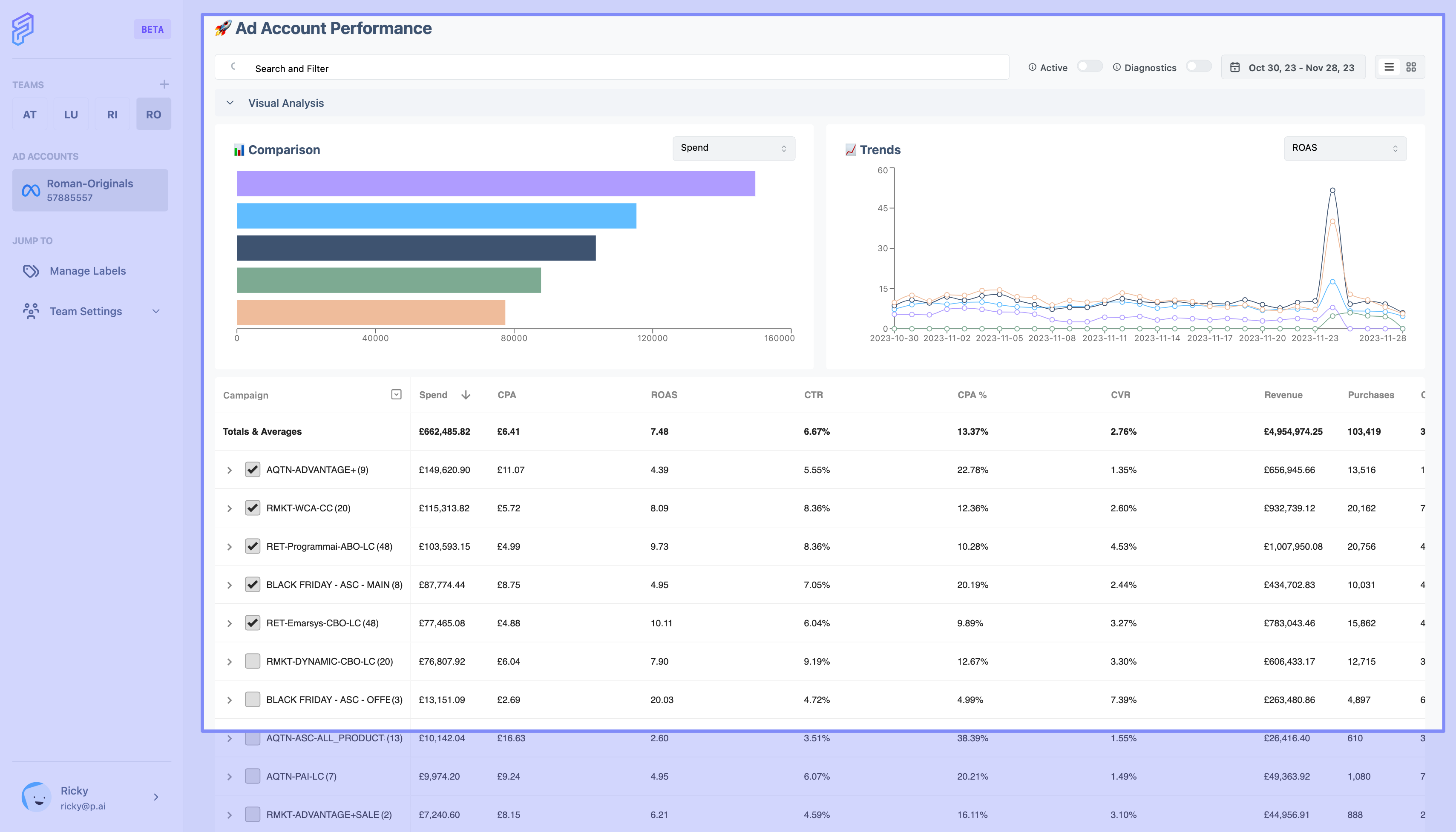
When I increase the date range dots appear on the line graph, making it very messy, ugly and hard to read
Status: Completed
When I increase the date range dots appear on the line graph, making it very messy, ugly and hard to read
Log in to comment and vote
No comments yet
Be the first to share your thoughts.